top of page
Shadeotech
Social Media Redesign
Shadeotech
Social Media Redesign
Before


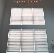
The social media posts at Shadeotech faced several issues that hindered their effectiveness in promoting the company. One of the primary problems was the lack of cohesion across the posts. There was no consistent visual theme, which made it difficult for the audience to immediately recognize them as part of the same brand. The posts also suffered from a significant issue with the visibility of the company logo. Often, the logo was either too small, poorly placed, or entirely absent, reducing brand recognition. Inconsistent messaging and unclear design elements further detracted from the posts' ability to engage the audience and reflect the brand’s identity.
After


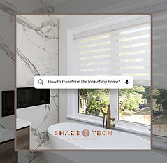
To address the various issues with Shadeotech’s original social media posts, I undertook a comprehensive redesign to create a more cohesive and professional look while improving brand visibility and user engagement. One of the major problems was the inconsistency in the overall design. The posts lacked a unified aesthetic, which made it difficult for users to immediately associate the content with Shadeotech. To solve this, I implemented a consistent color scheme, font style, and layout across all posts, reinforcing brand identity. This helped create a visual coherence that made the brand more recognizable and trustworthy.
Another significant problem was the visibility of the company logo. In many of the original posts, the logo was either too small or poorly placed, making it easy to overlook. I repositioned the logo in prominent yet unobtrusive locations and adjusted its size to ensure it was visible without distracting from the main content. By doing this, I maintained a balance between brand promotion and content focus, ensuring that the logo reinforced brand identity while allowing the visuals and messaging to stand out.
Additionally, the messaging within the original posts was cluttered and often lacked clarity, which could confuse the audience or reduce engagement. I simplified the text by using concise, impactful captions that were easy to read and relate to. For example, I introduced a search bar-style caption format that feels familiar to users, such as "How to transform the look of my home?" This approach was not only visually appealing but also more interactive, prompting users to think about their own needs while engaging with the post.
These improvements collectively made the posts more engaging, recognizable, and professional, contributing to better audience interaction and a stronger brand presence on social media. The overall redesign resulted in posts that effectively communicated Shadeotech’s values while ensuring consistency and clarity across all platforms.
Let's connect!
bottom of page